Sign companies are familiar with the costly consequences of signage design mistakes, including rework, project delays, and hidden expenses. Even visually impressive signs can become liabilities if fabrication, permitting, or installation requirements are not addressed from the start.
There are several critical aspects that must always be top of mind for every stakeholder involved in a signage project, including:
- On-site survey and field assessment
- Concept development and design
- Production and fabrication
- Sign permitting
- Installation
In this article, The Sign Pack team highlights key mistakes sign companies should avoid to keep projects on track and maintain profitability.
To help your business avoid financial losses and client dissatisfaction, we outline the most common design-related mistakes that can undermine signage projects.
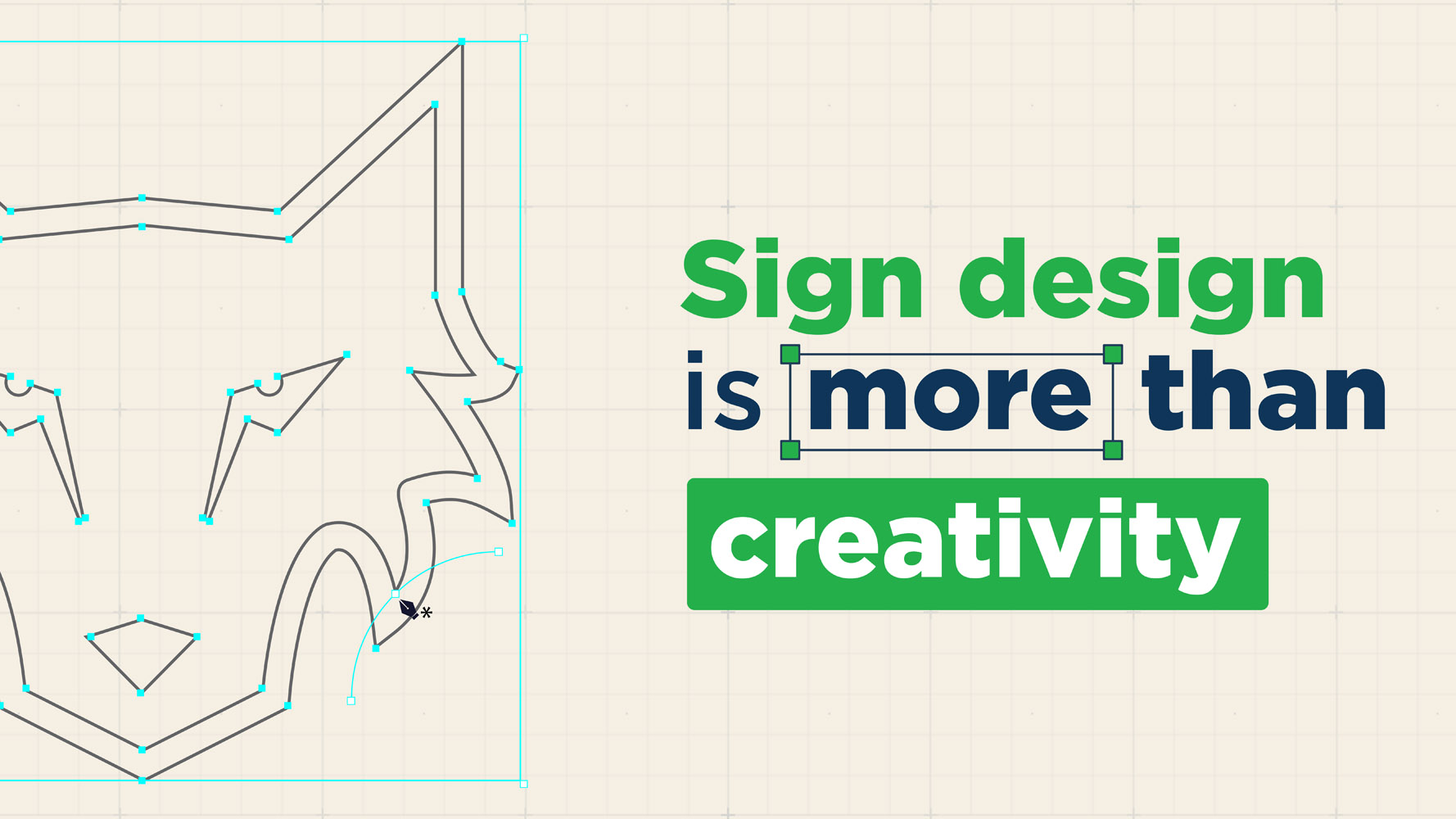
Treating Sign Design Like General Graphic Design
Sign design is a far more specialized discipline than general graphic design, with technical requirements that go well beyond aesthetics. Unlike graphic design for print or digital media, signage design must account for a wide range of real-world constraints, including:
- The physical environment where the sign will be installed
- Visibility, lighting conditions, and legibility index
- Viewing distance and audience viewing angles
- Material limitations and fabrication constraints
- Local codes and regulations
Graphic design usually operates under controlled conditions, while signage must perform in unpredictable environments. Treating sign design as standard graphic design is a common mistake that can harm both your business and your clients.
Design errors at this stage often lead to costly downstream issues, such as:
- Rework of sign design files
- Delays or complications during fabrication
- Installations that do not align with the original plan
- Permitting issues
- Signage that fails to perform as intended once installed
- Client complaints
- And other avoidable problems
Mistakes made during the design phase rarely remain isolated; they often cascade into fabrication, permitting, installation, and ultimately client satisfaction.
That’s why signage design must always be developed with production and installation in mind, while ensuring full compliance with all relevant sign codes for layout, size, illumination, and construction.
Why Sign Company Choose The Sign Pack
Trusted reliability. Designed for growing businesses.
From creative designs to express delivery, we enable your sign company to maximize productivity and profitability.
Below are several key factors that make sign design significantly more complex than general graphic design:
- Viewing Context: Signage must be designed with speed, angle, and viewing distance in mind, particularly for moving traffic, ensuring the message can be quickly read and understood by passing audiences.
- Material Constraints: Sign designers must understand commonly used signage materials and the fabrication challenges associated with each, including thickness, returns, finishes, and structural limitations.
- Technical Requirements: Professional sign designers require specialized skills in creating technical and permit drawings, an area that is typically not covered in traditional graphic design training.
- Environmental Factors: Signage must withstand weather exposure, varying lighting conditions, and long-term visibility and legibility requirements to remain effective and code-compliant.
- Functional Priorities: Successful signage design balances visual appeal with technical specifications, ensuring the sign is both buildable and capable of delivering its message clearly and efficiently.
When sign companies proceed with designs that lack fabrication awareness, issues often arise throughout the project lifecycle, from production to installation. This fundamental error leads to inefficiencies and lost profit.
If you would like a deeper understanding of the complete signage workflow, we invite you to read our article, Signage Production Process Best Practices: From Design to Fabrication.
Designing Without Real-World Viewing Conditions
Failing to assess real-world viewing conditions is a leading reason signage projects do not meet expectations.
Why does this happen?
Understanding the installation environment enables designers to make informed decisions about technical specifications and composition. Without this context, a sign that appears perfect on screen may underperform in the field.
Basic Preparation Before Starting a Signage Project
Every sign company strives for smooth project execution and minimal surprises. Achieving this requires a well-defined workflow that maximizes efficiency throughout each phase.
Before starting any signage design project, we recommend carefully researching the following aspects:
- Industry type
- Appropriate signage type
- Brand image you want to emphasize
- Goals and purpose of the signage
- Installation location and surrounding environment
- Audience demographics and preferences
- Visibility and message clarity
A comprehensive site and design audit is essential for supporting the signage development process and evaluating the proposed solution’s effectiveness.
This approach ensures your signage delivers long-term performance and maximum impact for your client’s business.
Understanding real-world viewing challenges helps designers identify best practices and avoid mistakes. Without this knowledge, a design may seem optimal during development but reveal issues after installation.
For this reason, a solid understanding of Design Principles for Effective Signage is critical. It ensures signage projects move smoothly from design through installation, while delivering functional, compliant, and high-performing results.

Balancing Aesthetics and Legibility
We consistently emphasize the importance of balancing aesthetics and legibility in real-world signage conditions. Several factors directly influence this balance, including:
- Color contrast against the background
- Decorative elements surrounding the text
- Lighting conditions and environmental factors
- Font type and font size
- White space, kerning, and letter spacing
- Viewing distance, placement, and the speed of passing traffic
Another critical factor is the available viewing opportunity for roadside signage after installation.
According to the On-Premise Sign Standards published by the United States Sign Council Foundation, viewing opportunities can decrease rapidly. At 40 miles per hour, for example, the viewing distance decreases by approximately 58 feet per second. At 50 miles per hour, that number increases significantly to about 88 feet per second.
These figures highlight the need for effective design strategies to ensure signage communicates clearly and is easily understood.
White Space Composition for High Legibility
One of the most important elements in ensuring signage performs well in real-world conditions is the proper use of white space. A 60/40 ratio between copy and white space is often considered a best-practice guideline for achieving high legibility.
For this reason, aesthetics should never be the sole consideration in signage design. Designers must also evaluate critical technical and environmental factors, such as:
- Readability and legibility
- Vehicle speed and traffic flow
- Viewing distance and viewing angle
- Audience reaction time and recognition distance
- Decorative elements and supporting graphics
- Environmental conditions
- Lighting and illumination factors
Ignoring these real-world technical factors can turn signage into an unnecessary expense instead of a strategic business asset.

Ignoring Fabrication and Installation Constraints
Even the most impressive signage design can become costly if fabrication and installation constraints are overlooked.
This oversight can erode profit margins and turn a straightforward project into a costly challenge for sign companies.
The reason this issue is so critical is simple:
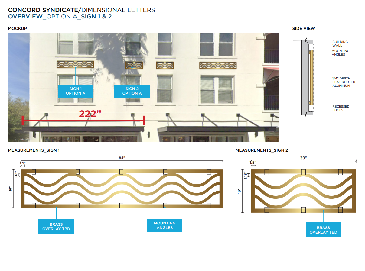
- Translating a signage design from concept to physical sign requires precise fabrication processes, many of which are still performed manually.
- Fabrication is constrained by material properties. Not all shapes, sizes, and visual details can be manufactured realistically.
- To ensure smooth fabrication and installation, signage specifications must be considered from the earliest design stage.
- Professional sign designers must recognize these limitations to ensure every design remains safe, efficient, and buildable without sacrificing quality.
Given the serious consequences of overlooking these challenges, signage design must always consider fabrication and installation. This ensures design specifications align with material capabilities and the chosen signage format.
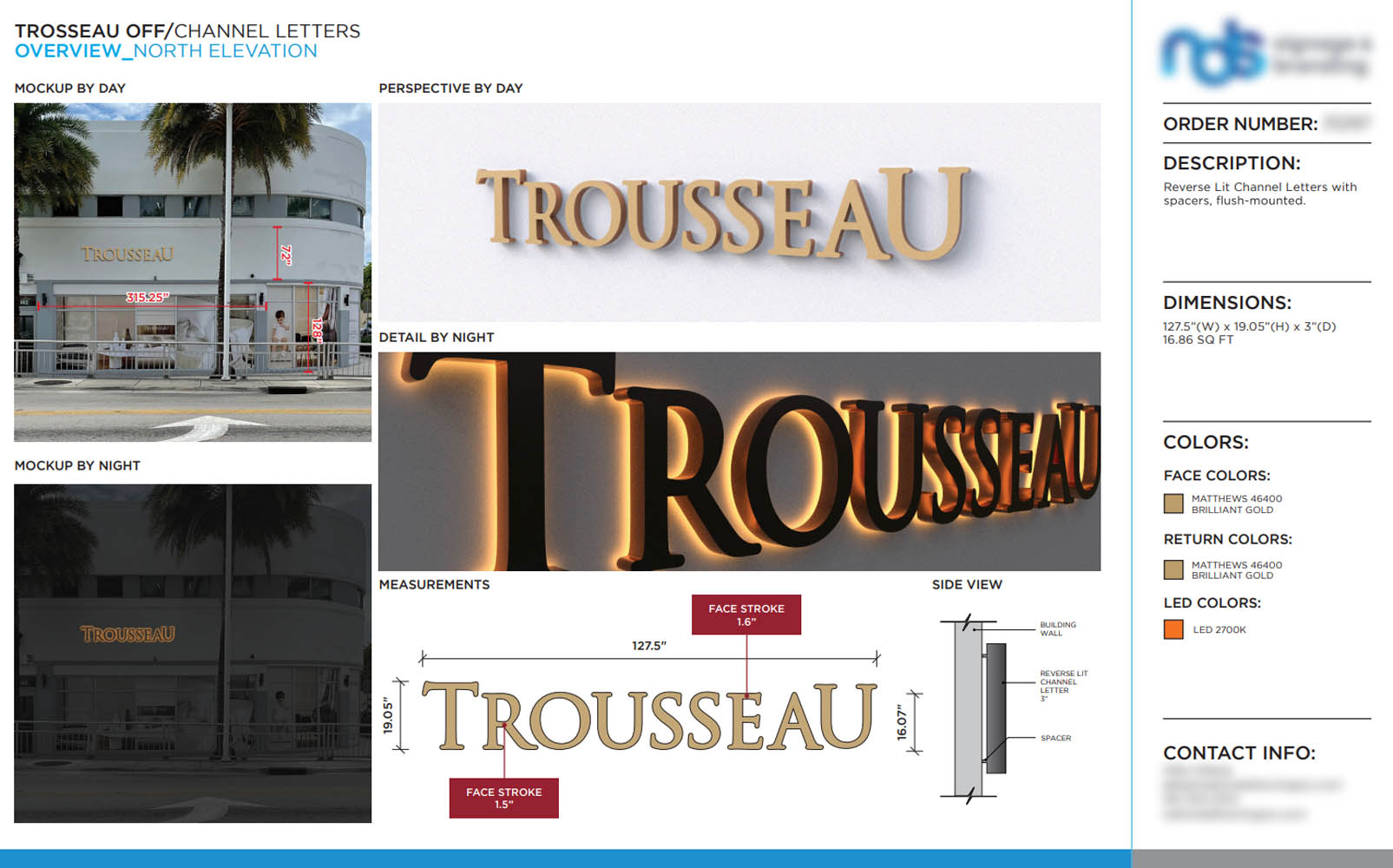
One of the most common examples of this issue relates to stroke thickness. According to industry standards, the minimum stroke thickness for channel letters is 1.5 inches. When the stroke falls below this threshold, proper welding becomes difficult, making fabrication more complex and increasing the risk of reduced structural integrity and visual quality.
To avoid costly design mistakes that disrupt fabrication and installation, we recommend the following best practices:
- Collaborate with experienced signage design specialists, especially for large-scale or complex projects.
- Request reviews and feedback from fabrication and installation teams during the design phase to confirm the design can be executed efficiently.
- Develop creative layouts and 3D renderings as communication tools for internal teams, clients, and fabrication specialists.
Following these best practices helps signage projects run smoothly, control hidden costs, and improve profit margins.
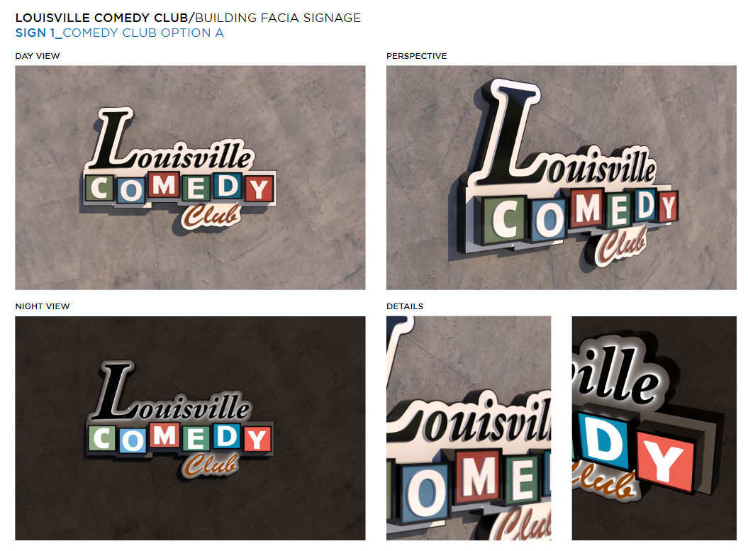
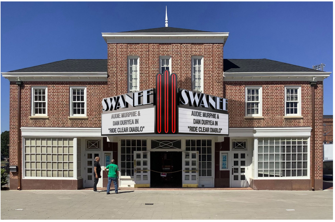
Overdesigning When Simplicity Works Better
Minimal signage design is not about cutting corners; it maximizes efficiency, clarity, and business results. Overly complex elements can dilute impact and undermine project outcomes and profitability.
In our article Signage Design Best Practices That Capture Customers’ Attention, we explain that every signage element must work together in harmony. When one element becomes overly dominant, such as a logo or decorative feature, it can diminish the sign’s overall effectiveness.
Designers must carefully balance several key elements, including:
- Branding elements or decorative accents
- A clear and focused core message
- Adequate white space
- Proper color contrast
Signage designs with excessive decorative elements or text often confuse viewers and make it harder to identify the core message quickly.
Industry professionals commonly refer to this situation as a low signal-to-noise ratio, in which the core message is lost amid visual distractions.
Why Overdesigned Signage Isn’t Good Business?
There are many reasons why overly complex signage designs are not beneficial for businesses. These issues affect multiple stages of a project, including fabrication, installation, and permitting. Most critically, excessive complexity reduces the sign’s legibility index.
Below are several key reasons why complex signage design works against business goals:
- Excessive text and decorative elements overwhelm viewers, making it harder to process information quickly and reducing overall impact.
- The primary message becomes difficult to grasp within seconds, as visual elements compete for attention.
- Unnecessary visual elements and layouts that add no functional value increase production costs without improving performance.
- Overuse of graphics and text often fails to create a strong or memorable impression.
- Highly complex elements are more likely to require changes during fabrication and installation due to material and construction limitations.
Recognizing the risks of overdesigned signage should encourage a more strategic approach to selecting design elements. Too many fonts, colors, or decorative features force viewers to work harder to find critical information.
When this is ignored, signage becomes forgettable and ultimately works against the business it is meant to support.

Why Simplicity Creates Greater Impact?
Effective signage design is about capturing a customer’s attention within seconds.
Today’s audiences face constant visual distractions, making it harder for signage to stand out. Attractive design alone is not enough; signage must be visually compelling, effective, and able to communicate the message instantly and memorably.
Simple and well-executed business signage ensures that critical messages are absorbed immediately and easily recognized. Beyond visual clarity, minimalist design also delivers practical advantages throughout the entire project lifecycle, including:
- Faster Approvals: Simpler designs typically move through the permitting process with fewer complications.
- Efficient Fabrication: Clean designs with fewer elements reduce production time and minimize material waste.
- Streamlined Installation: Simpler signage typically requires simpler installation and fewer on-site adjustments.
- Stronger Impact: Minimalist signage draws attention to key elements by strategically using white space.
Simplicity in signage delivers value for everyone. It helps sign companies operate more efficiently and profitably, while enabling clients to communicate their message clearly.
Simple design draws audience attention to the core message, making it easy to understand and recall. In contrast, overly complex signage complicates projects and increases the risk of hidden costs.
| Also Read: How Local Sign Shops Can Design, Quote, and Deliver Faster |
Designing Signage Without Considering Sign Codes and Permitting
One of the most serious mistakes to avoid is designing signage without considering applicable sign codes. Sign codes form the legal framework that governs the use of signage in public and semi-public spaces.
In the United States, these codes are adopted and enforced at the local level, meaning they directly reflect each city’s priorities related to safety, visibility, aesthetics, and land use.
Obtaining permits is required for signage installation, but the process is often underestimated or treated as an afterthought, leading to delays, design revisions, or rejection.
As discussed earlier, design mistakes can disrupt fabrication and installation. The same applies to permitting. Designs that fail to meet sign code requirements for the specific zoning or jurisdiction where the signage will be installed can significantly delay or block the permitting process altogether.
Below are several important considerations for developing signage designs to ensure they can be installed as planned.
Why Is Sign Permitting So Challenging?
Anyone who has dealt with planning departments or building officials knows that sign permitting can feel unpredictable. This challenge is common across many sign companies and continues to be a recurring issue. It is not uncommon to hear sentiments such as, “the process often feels one-sided,” or “communication can feel unresponsive.”
Sign codes regulate many aspects of business signage, including:
- Maximum sign size and overall sign area
- Type and brightness of illumination
- Mounting and installation methods
- Height, setbacks, and placement
- And other technical requirements
It is important to understand that city sign code requirements can vary widely from one municipality or jurisdiction to another. In other words, sign codes in neighboring cities may differ significantly, even if they are only a few miles apart. These differences are often influenced by factors such as:
- Local environmental character
- Building density
- Historical and aesthetic considerations
- Safety interpretations related to wind load, sightlines, and visibility
Despite these complexities, many sign companies still lack an effective workflow at the outset of projects. Designing first and retrofitting for sign codes later is a common misstep. When designs focus solely on branding or aesthetics without upfront zoning and code consideration, the risk of permit rejection increases sharply.
Designing with sign codes and permitting requirements in mind from the start is critical to avoiding costly delays and keeping projects on a predictable schedule.
Permitting delays usually aren’t the city “moving slow.” They’re caused by permit packages that aren’t truly permit-ready. If you want a complete system to reduce revisions and back-and-forth, read our guide, How to Fix the Sign Permit Drawing Bottleneck and Keep Projects Moving Forward.

A Practical Approach to Ensuring a Smooth Sign Permitting Process
Workflow mistakes in signage design often lead to repeated revisions or even rejection by city reviewers or zoning authorities. Situations like this inevitably extend project timelines, increase costs related to revisions and site surveys, and may ultimately result in client dissatisfaction.
In most cases, the root cause is not poor visual design. The real issue is that the design was created without considering zoning and sign codes from the very beginning of the project.
The Sign Pack encourages you to review the following three key steps as a practical solution to prevent these issues:
- Study the sign code limitations specific to the jurisdiction where the signage will be installed.
- Align the design with applicable sign codes to ensure size, illumination, height, and mounting methods comply from the outset.
- Develop a strong understanding of sign codes before starting any signage project and integrate those requirements directly into the design process.
The regulatory landscape for signage varies significantly across jurisdictions, creating a complex maze for sign companies to navigate.
To manage this complexity, it is strongly recommended to rely on trusted resources that help teams:
- Understand how sign codes are structured
- Identify common compliance pitfalls
- Prepare permit drawings that meet reviewer expectations
Industry resources, such as national sign codes and regulatory guides from organizations like the International Sign Association, are designed to educate and clarify how regulations are interpreted and applied across jurisdictions.
When sign codes are understood and applied early in the process, the results are clear:
- Designs are more likely to be approved on the first submission
- Permit drawings proactively address reviewer questions
- Revision cycles are reduced
- Project timelines become more predictable
Ultimately, sign codes can serve as a framework for smarter decision-making throughout the permitting process.

Collaborate with The Sign Pack for Smoother Projects and Higher Profitability
With more than 50 years of combined industry experience, The Sign Pack recognizes that skill gaps and limited technical knowledge are major bottlenecks in the signage industry.
Design stage issues can slow production and permitting if not properly managed. Additionally, designers skilled in 2D, 3D, ADA, wayfinding, and complex signage projects are increasingly difficult to find. At the same time, designer turnover further disrupts consistency and can severely impact workflow.
To address these challenges, The Sign Pack delivers comprehensive solutions focused on solving the most critical bottlenecks in the signage industry, including:
- Designer scalability
- Inconsistent file quality
- Errors in project information
As an extension of your team, we provide a modern infrastructure that empowers sign shops to operate more efficiently. Our support enables businesses of all sizes to scale confidently and improve productivity and profitability.
Our solutions are grounded in industry standards, technical precision, and practical production expertise.
Through TSP Platform 3.0, purpose-built to create a seamless experience across all types of signage projects, we help your company strengthen its competitive edge in the signage industry.
Discover how our infrastructure supports your business through benefits you will not find anywhere else.
Connect with our professional team and book a demo today to explore the complete solution.